Striving for a Double-Decker TweetDeck
 I’ve been a long-time user of TweetDeck, and have posted here before describing how to get it cleanly installed on Linux, but one thing that always irked me was the hard-coded, horizontal nature of the UI.
I run a large resolution on my laptop (1920×1200), but even with 8 searches, I’m running off the right of the screen. Horizontally scrolling to the right and left gets tiring fast. Very fast..
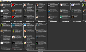
So I came up with a mock-up of a slightly new UI idea, which solves this problem in a somewhat elegant way. The configuration for this would be something along the line of thresholds of columns (a “table” in other vernacular), where you specify the maximum number of horizontal columns, and anything more than that flows to vertical rows.
See the below mock-up for what I’m talking about (click the image to enlarge):
So TweetDeck team, are you listening?


SOLVED: Sharing TweetDeck settings across multiple Windows and Linux machines | random neuron misfires said on October 28th, 2010 at 12:13 pm quote
[…] is a lovely app, graceful and very useful. It has its minor visual and UI bugs, but it’s the best I’ve seen out of the other hundreds of Twitter apps out there… […]